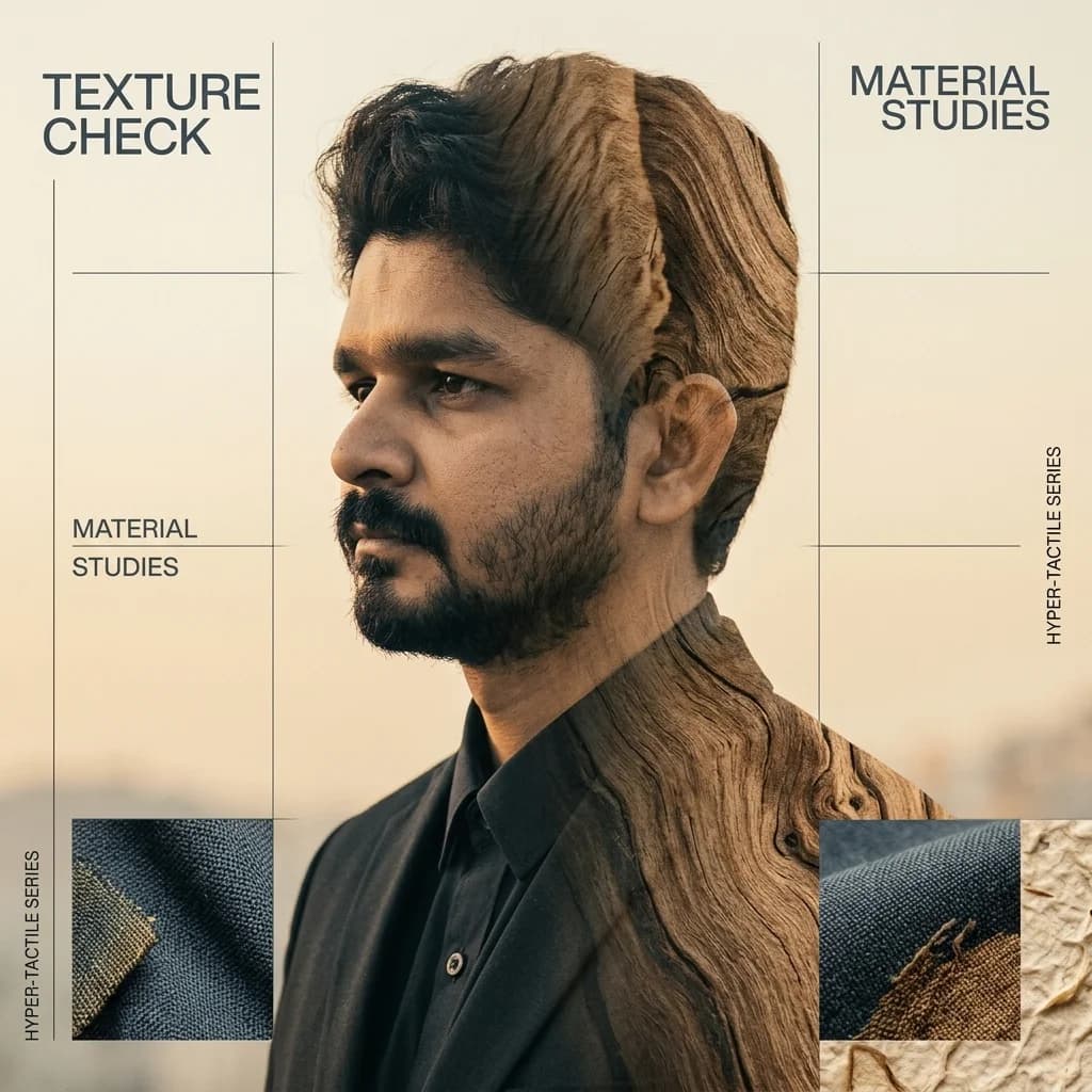
The Physical Sensation of Texture Check Hyper-Tactile
In the digital landscape of 2026, where loud and over-saturated graphics compete aggressively for attention, a quiet counter-revolution has taken place. The Prompt Texture Check Hyper-Tactile style is a design discipline defined by its physical substance. It synthesizes highly tactile, multi-dimensional overlays—high-density canvas grids, organic wood grains, textured handmade paper pulps, and industrial catalog borders—with high-fashion editorial grid layouts, precise halftone patterns, and a muted, nature-inspired earth tone palette (slate blue, warm cream, sandy ochre, desert sand, and warm natural browns). It projects a deep sense of tactile craftsmanship and premium physical catalog design, making it the perfect aesthetic for modern lifestyle brands, luxury design agencies, and state-of-the-art visual branding.
In this technical masterclass, we will guide you through transforming a modern studio portrait of our founder, Laxman Kumawat—wearing a structured black suit and shirt—into a physical, hyper-tactile masterpiece. By utilizing advanced material layering, contrast edge masks, custom earth-tone grading, and Swiss print editorial grid structures, we will convert standard corporate photography into a physical work of fine-art catalog design.
📌 KEY TAKEAWAYS: 5-PHASE WORKFLOW
- Phase 1: Stark Silhouette: Isolate the high-contrast suit portrait against a warm oatmeal/cream solid backdrop.
- Phase 2: Fabric Weave Grid: Overlay high-density canvas textures and textile threads onto the suit jacket.
- Phase 3: Tactile Substance Map: Layer organic wood grain, natural fiber lines, and paper pulp highlights onto the portrait shadows.
- Phase 4: Earthy Tonal Grading: Map color properties to the custom colorways (slate blue, warm cream, sandy ochre, and wood brown).
- Phase 5: Swiss Print Typography: Anchor the graphic inside a high-end structured coordinate grid.
🪵 THE METAMORPHOSIS: RAW VS HYPER-TACTILE 🪵

Traditional Studio Portrait
Stark white backdrop, sharp geometric posture, and deep black velvet fabric textures. The high contrast provides the perfect foundation for digital edge tracing.

Physical Material Synthesis
Physical material synthesis blending deep canvas fabric grids with suit shadow details, rich wood grain overlays, organic paper pulps, sand ochres, slate blues, and structured typographic catalog frames.
Step-by-Step Technical Guide
Blending synthetic high-contrast shapes with highly tactile, physical material overlays requires a meticulous balance of blending models, tonal map algorithms, and texture overlays. Follow this technical breakdown to achieve a state-of-the-art calm editorial masterpiece.
Step 1: Stark Silhouette Isolation & Oatmeal Canvas Injection
The foundation of all hyper-tactile artwork begins with strict silhouette boundary definition. We need to extract our subject from the raw photo and establish a physical, textured paper base backdrop.
- Isolate the Subject: Duplicate the raw portrait layer. Using the Pen Tool (P) or Select Subject with high edge refinement, trace a clean mask around the subject, cutting out the original white backdrop.
- Inject the Oatmeal Base: Create a solid color fill layer underneath your isolated subject. Instead of pure digital white, use a warm, organic oatmeal cream backdrop (
#FAF6EF) or sand grey (#EAE6DF) to establish an instant premium natural vibe. - Soften Edges: Feather the edges of the subject mask slightly (0.5px to 0.8px) to prevent the silhouette from looking artificially cutout against the warm cream background.
Step 2: Fabric Weave & Grid Map Overlay
To render the digital suit fabric as an ultra-premium physical substrate, we overlay high-density canvas grids and tactile fabric weaves directly onto the black suit jacket silhouette.
- Source or generate a high-contrast fabric weave or linen texture. Place it directly above your isolated portrait layer.
- Create a clipping mask so the fabric texture is strictly confined to the boundaries of the subject's suit jacket.
- Set the fabric layer blend mode to Overlay or Soft Light, and adjust the opacity between 8% and 12%. This projects subtle textile weave patterns across the flat black areas of the suit without destroying its deep shadow details.
- Apply a 0.5px Gaussian Blur to the weave layer to prevent digital Moiré patterns on high-density screens.
Step 3: Natural Tactile Substance Mapping
The soul of the Hyper-Tactile style is introducing natural, organic materials—wood grains, natural fiber lines, and paper pulp—directly inside the shadows and highlights of the composition.
- Find a high-contrast wood grain or handmade paper pulp texture with rich organic fiber threads. Place it above the fabric grid layer.
- Set the wood grain texture blend mode to Multiply, placing it directly over the dark suit fabric contours. Use a soft layer mask (brush opacity 20%) to gently feather the wood grain into the garment contours, keeping facial features completely clean.
- Underneath the wood grain layer, add a paper pulp highlights layer. Set its blend mode to Screen at 15% opacity to project subtle organic fiber specks and highlights across the entire artwork.
Step 4: Muted Natural Tonal Grading
The hyper-tactile color palette is anchored in physical earthy pigments. We replace all digital primaries with highly curated, Harmonious HSL colors: slate blues, desert sand, warm cream, sandy ochre, and dark natural wood browns.
- Create a Gradient Map adjustment layer at the very top of your layers stack. Set its blend mode to Color or Soft Light at 50% to 70% opacity.
- Configure the gradient ramp with 4 custom color stops to blend the highlights and shadows:
- Shadow Stop (0%): Muted slate blue (
#2B3E50) to map absolute blacks to rich industrial ink. - Lower-Mid Stop (35%): Sand ochre or dark earth brown (
#826B57) to add natural physical warmth. - Upper-Mid Stop (70%): Sandy desert sand (
#C3B091) to gradate highlights with a sandy pigment. - Highlight Stop (100%): Ultra-premium oatmeal cream (
#FAF6EF) to replicate luxury physical catalogs.
Step 5: Minimalist Swiss Grid & Tactile Catalog Framing
To finalize the premium tactile vibe, we wrap the artwork in a structured Swiss editorial grid and catalog branding frame, complete with barcode prints and thin margin lines.
- Swiss Typography: Select a geometric, highly readable sans-serif font like Inter, Outfit, or Space Grotesk. Overlay a title along the vertical margin at 30% opacity (e.g.,
TEXTURE CHECK // MATERIAL LAB // VOL. 11). - Catalog Barcode Stamps: Place a tiny technical barcode graphic or industrial catalog stamp in one of the bottom corners. Add crop marks, frame coordinates, and camera shutter specifications to emulate premium magazine layouts.
- Thin Grid Margins: Draw thin, 1px desaturated lines at the margins, creating a structured canvas border that frames the double exposure beautifully. Add a small block of vertical metadata text explaining the camera settings or focal specs.
💡 EXPERT TIPS FOR A HYPER-TACTILE MASTERPIECE 💡
- Preserve Facial Clarity: While blending the wood grain into the suit jacket, keep the skin tone on the face completely clean of heavy textures. This ensures the portrait retains its organic, natural human beauty.
- Control Moiré Patterns: Always apply a subtle 0.5px Gaussian Blur to high-frequency fabric grids. Leaving them too sharp can cause weird optical patterns on mobile screens.
- Balance the Blends: Ensure your screen layers are desaturated before blending. High-saturation green landscapes will clash with the muted earthy tones of the final gradient map.
- Integrate with AI Prompts: To generate complementary landscape assets or background textures, try using this prompt blueprint:
"Texture check hyper-tactile portrait style, double exposure, high-density canvas grid fabric weave overlay, organic wood grain patterns, paper pulp details, soft warm lighting, desaturated earth-tone color grading, minimalist Swiss editorial grid lines, premium layout".
❓ FREQUENTLY ASKED QUESTIONS (FAQ)
Q: How do I control the fabric grid intensity across different display resolutions?
A: Set the weave overlay opacity strictly between 8% and 12%, and apply a 0.5px Gaussian Blur to prevent Moiré patterns on high-density displays.
Q: What is the best blending mode to merge the organic wood grain into suit shadows?
A: Place the wood grain texture layer directly above the suit, set its blend mode to Multiply, and use a soft layer mask to feather it smoothly into the contours.
Conclusion: Create Your Physical Masterpiece! 👑
The Texture Check Hyper-Tactile style is the ultimate expression of material substance and tactile digital craftsmanship in 2026. By taking a structured raw studio portrait—like Laxman Kumawat's signature black suit image—and combining it with linen grid weaves, organic wood grain shadows, handmade paper pulps, and desaturated earthy tones, you create an artwork that breathes physical substance. Set your layout grids, adjust your opacity blend modes, and start crafting your own calm tactile masterpieces today! Stay tactile!